From hidden feature
to flagship tool
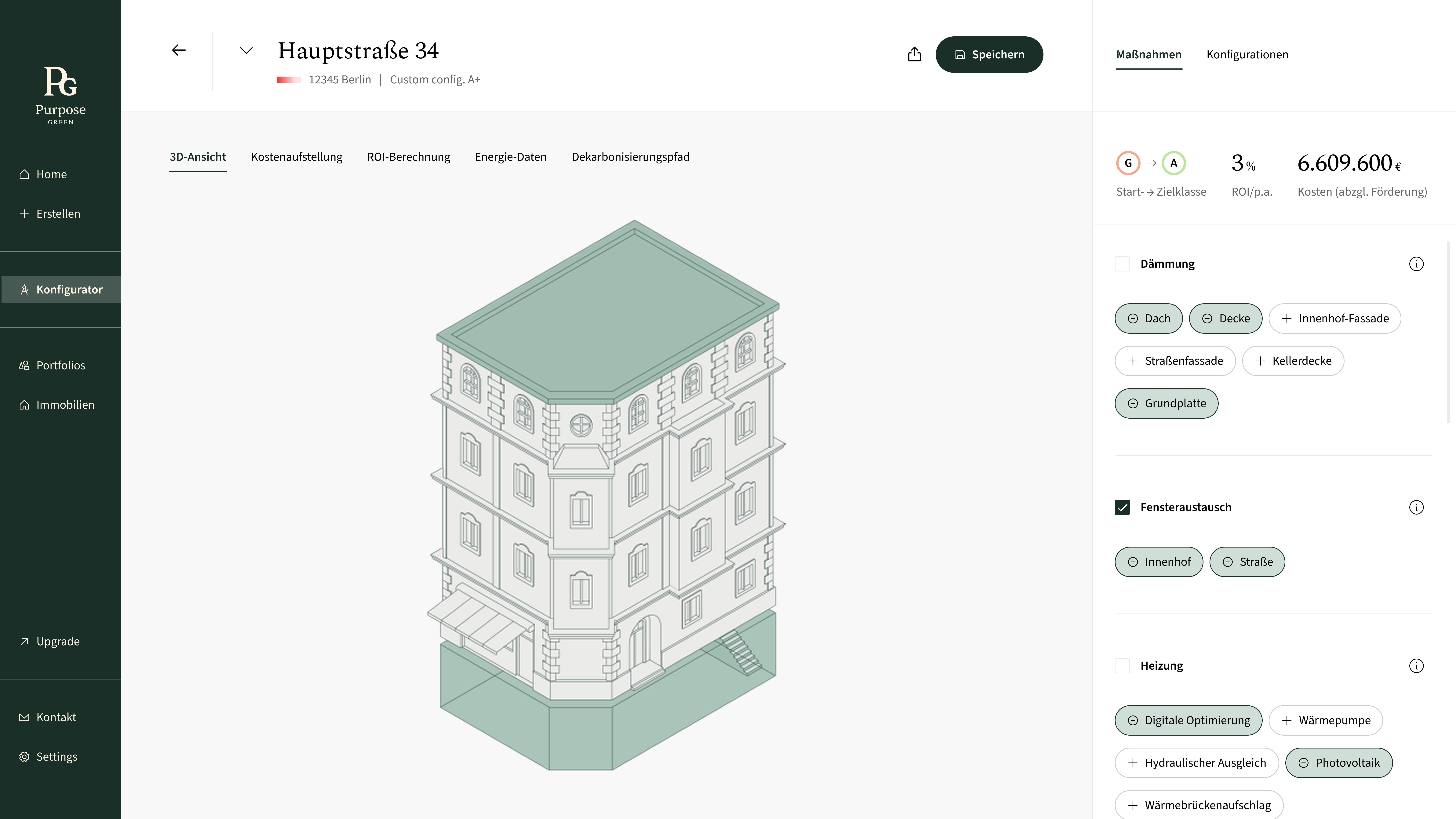
The Energy Measures Configurator is a tool that helps asset managers explore renovation scenarios to improve energy efficiency while optimizing investment costs.
What started as an experimental feature hypothesis evolved into the most valuable and engaging part of the platform, ultimately becoming a standalone product experience.
Static reports,
no flexibility
Asset managers could only download static renovation reports with predefined packages. While informative, these reports lacked flexibility, leaving users unable to explore tailored renovation scenarios, assess ROI, or understand the real-world impact of their decisions. Engagement ended after downloading, and complex energy data was difficult to interpret.
Tested with real users,
not just assumptions
I ran internal workshops with the energy team to map out the full scope of data and use cases, then validated a prototype in two customer usability tests. The sessions revealed both what was working and what was missing.
That is exactly what I needed.
— Customer usability test, session 1Alles super selbsterklärend.
— Customer usability test, session 2Users responded warmly to the flexibility — but feedback was clear on what was still missing.
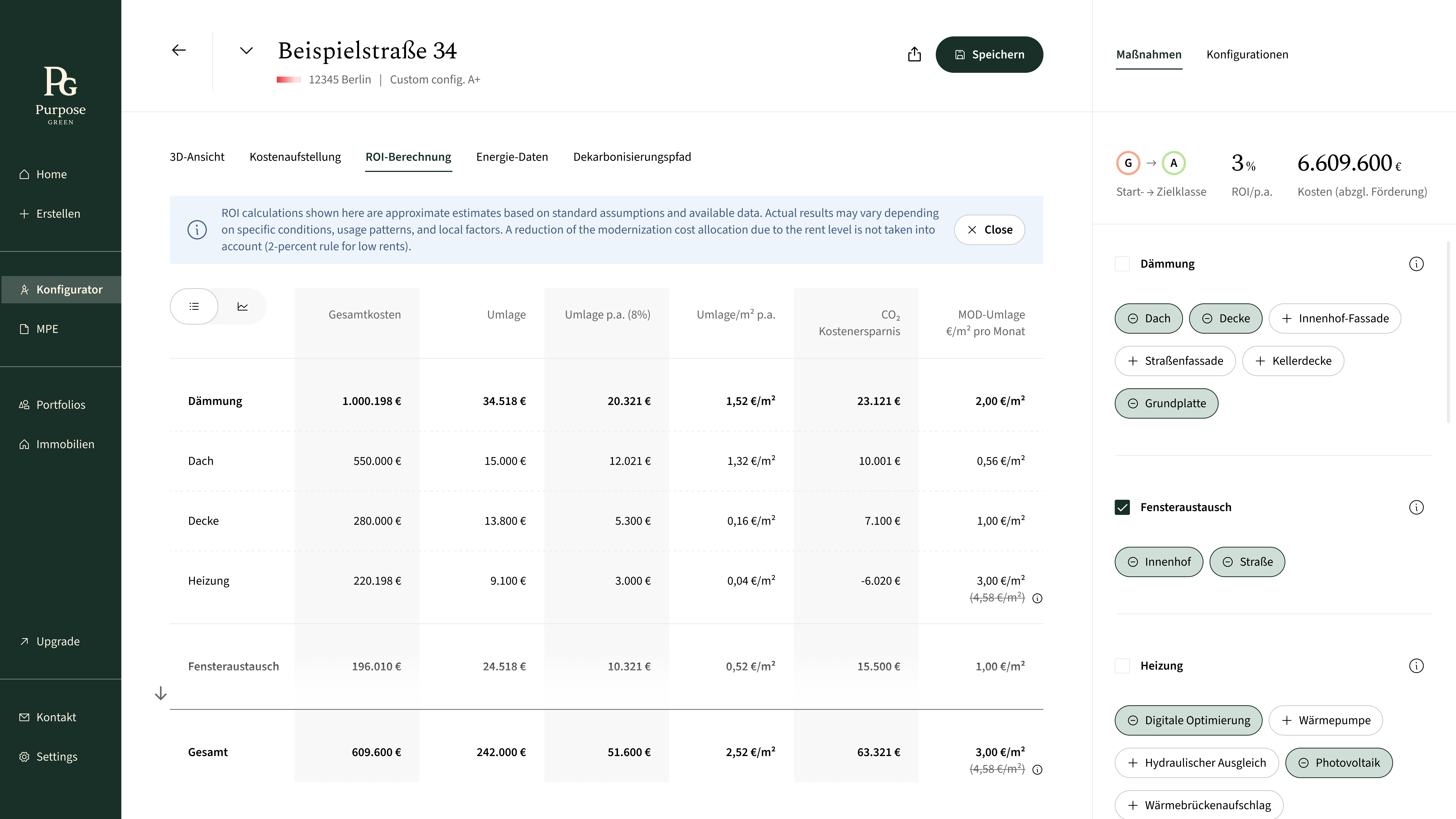
- Pricing wasn't transparent enough — users wanted to understand how numbers were calculated, not just see totals.
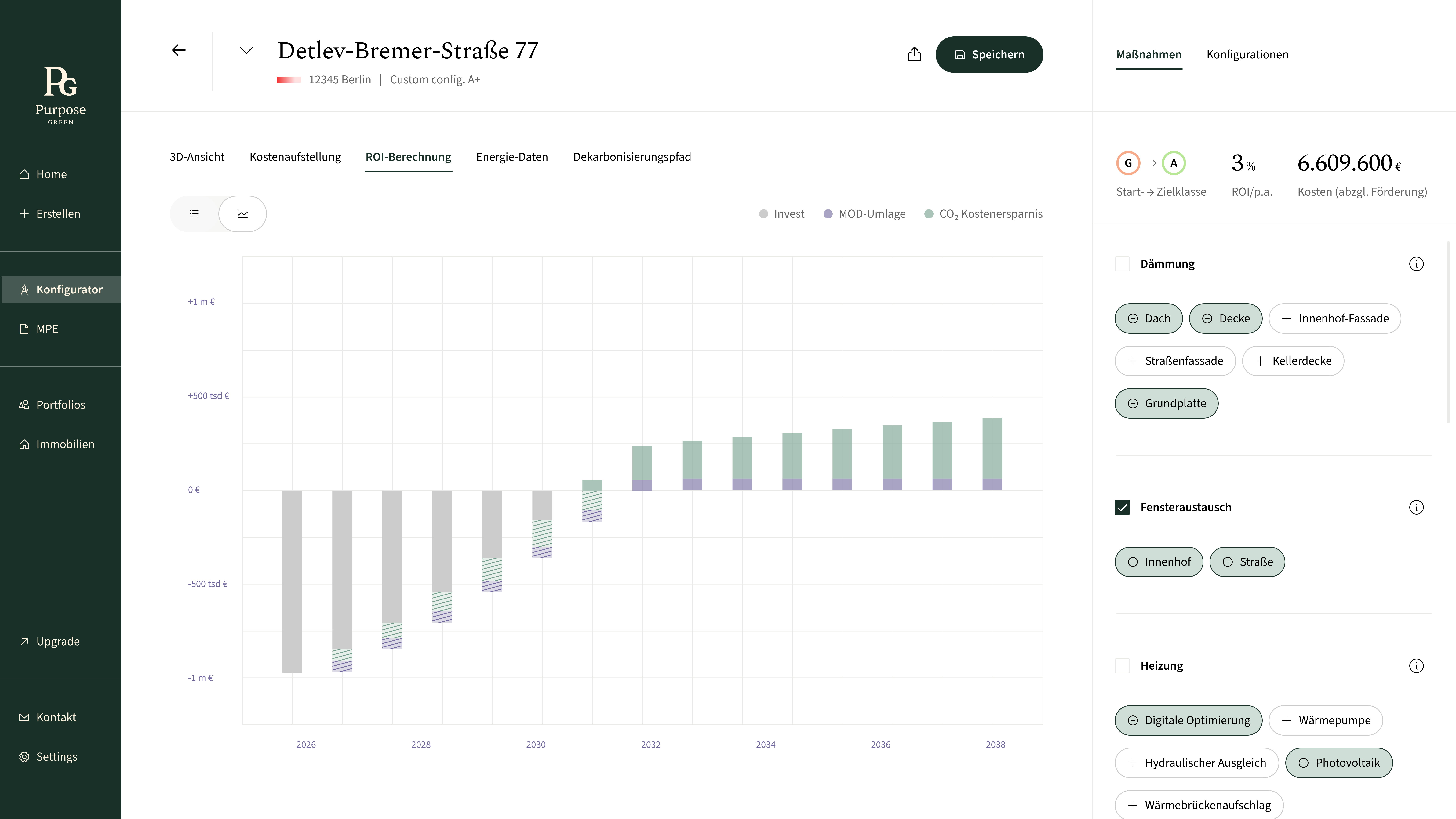
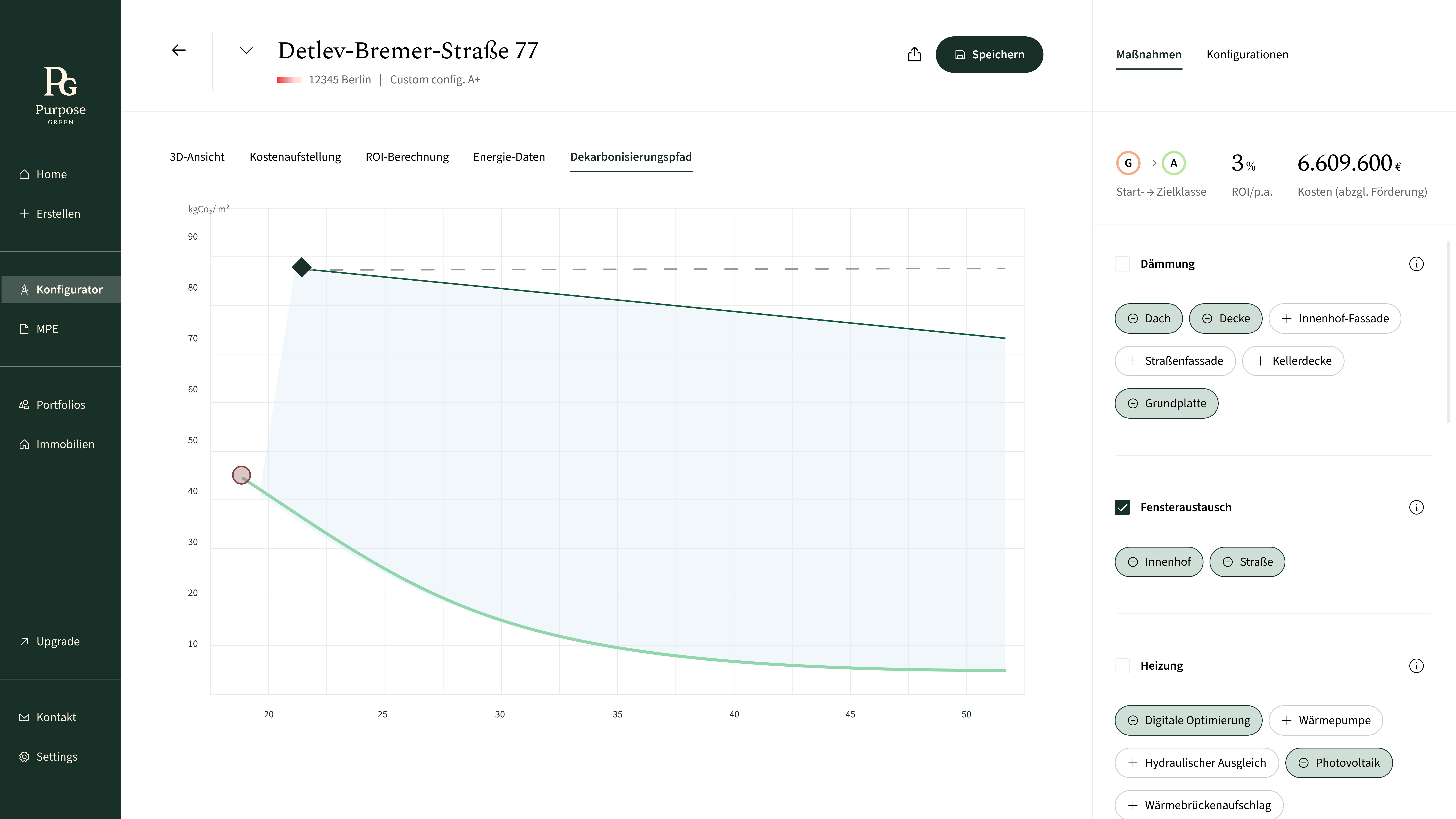
- Energy metrics needed more granularity. Headline figures alone weren't enough for informed decisions.
- Export functionality was expected but absent. Users planned to share results with stakeholders.
- Intuitive flow had to be preserved even as data density increased.
Three versions,
one direction
The configurator didn't start as a product — it started as a basic property view. Each iteration opened it up further.


The feature users
kept coming back to
Shifting product value
What started as a reporting feature evolved into a decision-making tool. The configurator repositioned the product from passive output to an active planning experience.
Enabling better decisions
Users could explore tailored scenarios and immediately understand trade-offs, allowing them to make more informed and confident renovation decisions.
The center of attention in every demo
The configurator consistently drew the most interest during product demos and industry exhibitions (Messen), becoming a natural entry point for conversations with potential clients and stakeholders.
Making complex data actionable
Energy, cost, and decarbonization data became directly usable, helping users move from analysis to action without needing external tools or expertise.